The Bug That Shows Up on the Bill


Most bugs announce themselves. The app crashes, a test goes red, someone files a ticket. The worst one I shipped this month did none of that. It showed up on the bill.
A user opened a chat with the AI agent inside the product I am building. They stayed longer than I had planned for. Tool calls bled into the context. A session I had designed for ten messages ran to forty. Tokens stacked quietly the whole time. Nothing broke. The conversation worked fine. The only place the problem surfaced was the invoice at the end of the month, where a number was larger than it should have been. The agent had been doing exactly what I asked. The cost was the side effect I had not priced in.
That is when I started paying attention to a design decision I had been treating as cosmetic.
Two Honest Answers to the Same Problem
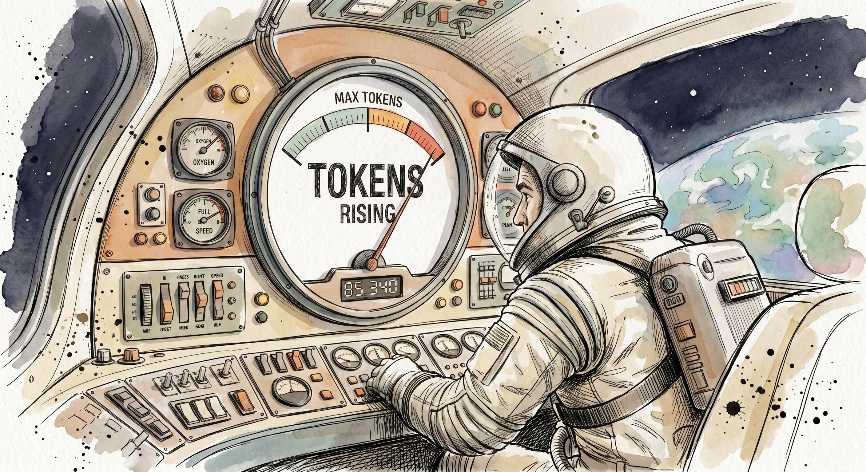
Watch how the best AI coding tools handle context and you see the question laid out in the open. Claude Code shows you the technical reality. There is a status line with your current context, a token count, a percentage of the window used. When you approach the ceiling, it auto-compacts in the background. The system state is visible, and the tool trusts you to read it.
Codex picked the other side. No status line. No percentage. When compression kicks in, it shows up inline in the chat and then gets out of the way. The machinery is there, you just are not asked to look at it.
Both are honest answers. The reason the meter keeps getting built is that it is the correct engineering instinct. If the system has a finite window and a real cost per token, surfacing that state feels like respect for the user. You are not hiding anything. You are giving them the controls. Most dashboards in our industry exist for exactly this reason, and most of the time it is the right call.
The trouble is that a token meter is not a dashboard. It is a worry you handed to someone who did not ask for it.
The Product Decision and the Cost Decision Are the Same Decision
Here is the thing I missed at first. When you ship an AI feature, the product decision and the cost decision are not two separate conversations that happen to overlap. They are one decision wearing two hats.
Every chat token I save is a euro I keep. That part is obvious, it is just margin. The part that took me longer to see is the other direction. Every bit of cognitive load I remove from the user is a session that runs longer and converts better. A meter does not only report cost. It changes behaviour. The moment a user understands that the number going up is money leaving their pocket, or worse, money leaving mine in a way they feel responsible for, the conversation stops being about their problem and starts being about the budget.
A token meter does not report the cost. It moves the cost onto the user, and the new cost is anxiety.
So the question "show the meter or quietly compact" is not a UX detail. It is a question about who carries the meter. The engineer in me wants to expose the truth. The founder in me has to ask what that truth does to the person reading it.
What Disappears When the User Watches the Meter
A user who has to watch a token count to keep their session affordable is a user who eventually decides not to bother. They do not file a complaint. They close the tab. The product quietly becomes "the thing that made me anxious about cost," and that framing follows it around. It is a bad product, not because the feature failed, but because the feature made the person feel like a meter was running on them. It was.
What gets lost is the session itself. The conversation that would have gone to forty useful messages stops at twelve, because the user got nervous around message ten and wrapped up early. The value was right there, and the interface scared them away from it. You never see this in your analytics as a problem. You see it as shorter sessions and call it engagement that did not stick.
The user who never sees the meter does not have that moment. The session stays useful. The bill stays predictable. My margin survives the week. Same underlying cost, completely different experience, because the complexity got absorbed instead of exposed.
Cost-Aware Design Is a Discipline, Not a Setting
So I shipped sliding-window memory for Nova, the agent inside the product. Keep the last twenty messages in full. Summarize the older ones inline. Configurable threshold for the cases that need it. No widget, no percentage, no anxiety. The agent compacts the older context in the conversation flow and keeps talking.
The honest framing is that I cannot afford to let users see the meter, neither emotionally nor financially. And the more I think about it, neither can they. The interface is supposed to do the hard accounting so the human does not have to. That is the whole point of building software for people. We somehow forgot it the moment AI made the unit cost visible and started reaching for a gauge instead of a design.
This is the part that feels new. For most of product management, cost lived in a spreadsheet far away from the screen. With AI features, the cost is generated by the same interaction the user is having, in real time, token by token. That collapses the distance between the product surface and the cost surface. They are now the same surface. Designing the interaction is designing the cost, whether you admit it or not.
The Cost Surface Is a Design Surface Now
I keep coming back to how strange this would have sounded a few years ago. A product decision about a chat window that is also, directly, a decision about gross margin. No translation layer, no finance review, the same screen.
That is going to be true of more and more of what we build. As AI moves from a feature into the substance of the product, the question stops being "what should we expose to the user" and becomes "what should the product quietly carry so the user does not have to." The teams that treat that as a UX afterthought will keep shipping meters and wondering why sessions end early. The ones that treat it as a core part of how the product thinks will build things that feel calm to use and happen to be cheaper to run.
Show the meter, or quietly compact. I picked compact. The more interesting realization is that I was never really choosing a widget. I was choosing who gets to feel the cost.
Related Posts
Nobody Asked Me to Write That Down
I used to take my backend developers into customer interviews. The understanding lived in the room, and we never wrote it down. It worked beautifully, and it left almost no trace. Product teams document their output obsessively and their reasoning almost never, which is why a strategy can walk out the door with one person.
Product Update: June 2026 - Context, Converted
Outcomet ships a standalone Campaigns module, automatic contact deduplication, GitHub/Jira delivery sync, and a new MCP server for connecting outside agents to your workspace.


Product Upate: May 2026 - Close the Loop
Outcomet's Validation Tree, Roadmap canvas, and Delivery Alpha connect product discovery, planning, and delivery into one graph, with Nova acting across all of it.